The Matching Set Myth: Why Contrast Can Give a Room Shape
Furnishings need not match to feel coherent. Learn how repeated details and deliberate contrast create a room with character, balance and visual shape.
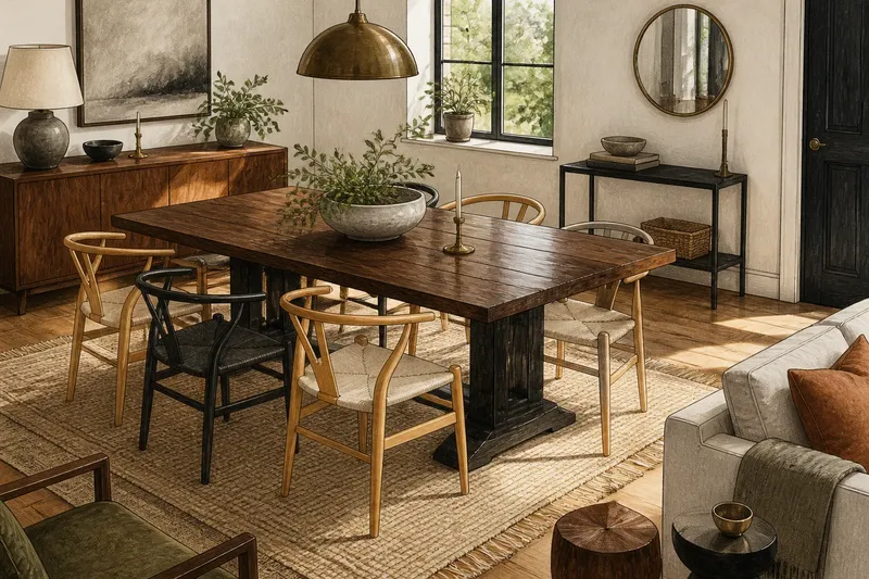
A dining table arrives with chairs in a different wood, and suddenly the room feels less like a catalogue page and more like a home. Matching furnishings are not the only way to make a room feel coherent. A few repeated details can connect unlike pieces, while contrast gives each one room to be noticed.
The useful question is not whether everything belongs to the same set. It is whether the pieces share enough visual language to feel related, and whether their differences serve a purpose. Three approaches help: repeat a strong feature, mix pieces within a shared palette, or let one deliberate contrast lead. Each suits a different appetite for variety.
Matching furnishings create calm through repetition
A matching set repeats the same material, shape or finish across several pieces. A bed, bedside tables and chest in one timber, for instance, create a clear visual family. That repetition can make a room feel settled, especially when the architecture already has strong details or the furnishings need to recede.
This approach suits people who prefer a quiet backdrop, want to furnish a room without making many individual decisions, or already have patterned wallpaper, colourful textiles or distinctive flooring. Similar pieces can also make a small collection of furniture feel intentional. Their shared appearance does some of the organising for you.
But a set can flatten a room if every item has the same scale and silhouette. The eye has few changes to register, and furniture may read as one large block. The remedy need not be replacing the set. A different lamp, a woven basket or a contrasting bedcover can introduce a change of texture and shape without undoing the calm.
Choose matching furnishings when continuity matters more than individual pieces. If the room looks too uniform, alter one visible feature rather than adding several unrelated accents.
Repeated details connect pieces that are not identical
Coordination is different from matching. It means separate pieces share a few recognisable traits: perhaps a warm timber tone, rounded corners, a dark metal detail or a similar degree of visual weight. A dining table and chairs can differ in material yet feel connected if another element repeats across the group.
Think of repetition as a thread, not a rule. One feature repeated in a few places is often enough. A blackened metal handle might echo the legs of a side table and the frame of a mirror. A curved chair back could find a quieter rhyme in a rounded pendant shade. The pieces need not be identical; they simply need a point of recognition.
To choose a thread, look at what is already fixed in the room. The floor, door hardware, window frames and built-in shelves can supply a colour or material worth echoing. Then carry that detail into furnishings in varied forms. For example, repeat a timber tone rather than buying every piece from the same range.
This approach suits rooms assembled over time, and anyone who likes a collected look but still wants an underlying order. It also gives you flexibility: a chair can change without requiring every nearby item to change with it.
Deliberate contrast gives a room a focal point
Contrast is a visible difference between furnishings. It might be a pale chair beside a dark table, a sculptural stool next to a plain sofa, or a smooth metal lamp against rough timber. Used with intention, contrast gives the eye a point of interest and helps a room avoid feeling overly uniform.
The important distinction is between contrast and contradiction. Contrast has a reason: one piece might stand out because it has a different outline, material or colour. Contradiction is a collection of differences with no clear relationship, so each object competes for attention. A room can contain varied styles and still feel composed if one feature leads and the rest support it.
Say you have inherited a broad, dark dining table and want to add chairs. Imagine choosing lighter chairs with simple curved backs, then repeating their pale finish in a bowl on the table and a frame nearby. The table remains the visual anchor; the lighter chairs provide contrast; the small repeated notes connect the group. The expected result is a dining area that feels varied but not scattered.
This approach suits people who enjoy distinctive finds, have one strong piece they want to keep, or want a room to feel personal. It is less comfortable for someone who prefers every furnishing to blend into the background. In that case, keep the contrast limited to one item or a small pair.
Compare the three approaches before choosing
- Matching: Check whether the room already contains strong patterns, colours or architectural details. If it does, choose a consistent set for a quieter backdrop; if it does not, consider one contrasting furnishing to prevent the room feeling too uniform.
- Repeated details: Check for a material, shape or finish already present in fixed features. If you can identify one clear thread, echo it selectively in separate pieces; if no thread feels natural, choose a shared colour or silhouette instead.
- Deliberate contrast: Check whether one furnishing deserves to lead. If there is a clear anchor, let another piece differ in one visible way and repeat a small detail nearby; if several items already compete, keep new pieces quieter.
- Visual weight: Check how substantial the existing pieces appear from the doorway. If one anchor looks much heavier than its companions, favour furniture with a more substantial outline; if the group already feels balanced, vary the finish or shape instead.
- Room character: Check which fixed feature catches the eye first, such as a grained floor or coloured rug. If it has a strong presence, choose furnishings that echo or gently contrast with it; if the room feels plain, allow one piece to supply a clearer focal point.
- Existing set: Check whether a matching group feels calm or reads as one block. If it feels too uniform, change one visible texture or outline; if it already sits comfortably, leave the set intact and avoid adding accents without a reason.
These approaches can work together. A room might have matching bedside tables, a contrasting armchair and repeated brass details. The choice is not a strict design identity; it is a decision about which relationship should be most noticeable.
How can unrelated furnishings still feel coherent?
How many details should repeat?
Begin with one feature, such as timber tone, metal finish or a recurring curve. Repeat it where it feels natural; if the relationship remains hard to see, echo the same feature in another small detail rather than introducing a second unrelated motif.
Can different wood tones sit together?
Yes, if their differences look deliberate rather than accidental. A shared warm or cool quality, a repeated shape or a connecting textile can help the woods read as a considered mix; if the tones pull apart, use a rug or upholstery colour to link them.
What should stand out in a mixed room?
Let one furnishing or one quality lead, such as a distinctive silhouette or a strong material contrast. If several pieces demand attention at once, reduce competing accents or make the quieter pieces simpler.
Should a sofa and armchairs match?
No. They can share a related colour, scale or texture while differing in shape or upholstery; if one piece is patterned, calmer companions can keep the arrangement legible.
Choose by the room’s existing character
Before bringing in another furnishing, notice the room’s strongest existing feature. It could be a deeply grained floor, a plain sofa, a coloured rug or an old cabinet with an unusual shape. Decide whether the new piece should blend in, repeat a detail or provide contrast. That decision narrows the options without demanding a complete scheme.
Scale matters, too. Two pieces can share a finish and still feel unrelated if one is visually heavy and the other appears delicate. Compare their outlines and presence from the doorway, where the furnishings are seen as part of a group. A substantial table may need chairs with enough visual weight to hold their place, even when their colour differs.
Where a piece is difficult to replace, begin with it and build outward. Where you are choosing several new items, decide first which approach should dominate, then vary only the supporting details.
Use colour, material and shape as separate choices
It is easy to treat a furnishing as one indivisible decision: a chair is either a match or a contrast. In practice, its colour, material and outline can each relate differently to the room. A chair may echo the sofa’s colour but contrast with its shape. A timber side table may relate to the floor’s warmth while differing in grain and form.
This separation gives you more room to adjust the mix. If a new piece feels too conspicuous, it may not need replacing. A cushion, throw or nearby object can repeat one of its colours. If it disappears, a difference in texture or outline may be enough to distinguish it.
Imagine a room with a plain grey sofa, a honey-coloured floor and a dark, square side table. You want to add an armchair, and the available options are a grey chair with a straight outline or a rust-coloured chair with a rounded back. Choose the grey chair first because its colour links to the sofa, while its different outline adds distinction. If it looks too similar once placed beside the sofa, add a rust cushion to connect it to a warm-toned object already in the room; if it still disappears, choose the rust chair instead, accepting a stronger focal point in exchange for less colour continuity. The resulting choice is guided by which relationship matters more, not by a need for identical furnishings.
A furniture catalogue image or a paper cut-out can help you think through the broad arrangement, but it cannot show how a particular finish or texture will relate to the room. Give more weight to the actual outline, material and colour of the piece than to its label or the other items shown with it.
For a coherent room, furnishings do not need identical finishes or a shared label. They need relationships a person can notice: a repeated curve, a linking material or a purposeful difference in scale. Matching offers calm, repeated details offer flexibility, and contrast gives a room a focal point. Choose the balance that suits the objects you live with, then let the strongest piece set the tone.
The matching set myth is easy to leave behind once you can name what holds a room together. Before choosing a companion piece, ask which feature it will repeat and which one it will change. That distinction can make a new addition feel considered, even when it comes from somewhere entirely different.