How Matte and Satin Paint Change the Same Colour
Paint finish in the same colour affects reflected light and visible wall texture. Compare matte and satin on your own wall to choose the look that suits it.
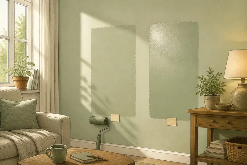
Two paint samples in the same colour can look unlike each other on a wall: one seems quiet, the other catches the eye. Paint finish in the same colour changes how light returns from the surface, so it can alter the perceived brightness and the visibility of texture.
Matte paint gives colour a quieter appearance
Matte paint has little visible sheen. Its surface scatters reflected light rather than forming a clear highlight, so the colour often looks even and subdued across a broad area.
That softer reflection may make small surface variations less conspicuous, but it does not remove bumps, filled patches or ridges. Shadows can still expose them where light falls along the wall rather than directly onto it.
Choose matte when you prefer a restrained look and do not want a strong sheen to draw attention across the wall.
Satin paint adds a gentle sheen to the same colour
Satin reflects more light than matte, which can make a painted area seem brighter or more luminous. The pigment colour has not necessarily changed; the finish alters the way light reaches your eye.
On a smooth wall, satin can give colour a polished quality. On a textured or uneven surface, reflected highlights may make roller stipple, plaster changes or fine scratches easier to notice. The result depends on both the wall and the light reaching it.
Choose satin if you like a mild sheen and are comfortable with the surface attracting more visual attention.
Light direction changes how each finish reads
Broad, diffuse daylight tends to make sheen look gentle. A lamp placed close to a wall, or low sun entering from the side, can create more defined highlights and shadows. Those effects may make the difference between matte and satin more apparent.
Think about the room’s usual use. A wall beside a bright window may show reflected light across a larger area, while a wall lit mainly by a shaded lamp may look more even. Neither finish has a fixed appearance apart from its setting.
Say you are choosing for a pale green wall beside a window. In this invented situation, you apply matte and satin samples in the same colour to adjacent parts of the wall, following the paint maker’s directions. In morning daylight, the satin patch looks brighter where the light falls; later, with the curtains drawn and a shaded lamp on, the difference is less pronounced. The visible change helps you decide whether that shifting sheen suits the room.
Surface texture affects the choice between matte and satin
Matte usually draws less attention to reflections, which can make a slightly uneven wall seem calmer. Satin may emphasise the same unevenness when a highlight crosses it. This is a visual effect, not a repair to the wall.
Texture includes more than obvious bumps. Roller stipple, filled areas, fine scratches and changes in plaster can all interact with reflected light. A smooth patch beside a textured one may become easier to distinguish under satin, even when both have the same colour.
For a realistic comparison, use samples on the actual wall rather than relying only on a smooth card. That reveals how the finish interacts with the surface you intend to paint.
What should you check before choosing a finish?
- Check whether the wall looks calm or reflective in its usual light; if you prefer a quieter appearance, choose matte, and if you welcome a visible sheen, compare satin in place.
- Check for bumps, filled patches or roller stipple; if these details stand out under satin, choose matte or prepare the surface before painting.
- Check whether daylight or a lamp creates a clear highlight on the wall; if it does, assess satin in that light, and if the reflection distracts you, favour matte.
- Check the same colour in both finishes on the same wall; if one seems brighter, decide whether you like the sheen effect before changing the colour.
- Check the wall from the doorway and your usual seat; if the finish catches your eye from those positions, choose the less reflective option or reconsider its placement.
- Check the sample after it has dried as directed; if its appearance differs from the wet paint, base your decision on the dried sample and the maker’s instructions.
For a fair comparison, keep the colour and wall constant while changing only the finish. Follow the paint maker’s directions for applying samples, as products can differ.
Which paint finish questions matter most?
Does satin make a colour lighter?
Satin can look brighter because it reflects more light, though the pigment colour has not necessarily changed. Compare the finishes on the wall before deciding that the shade itself is different.
Does matte hide every wall flaw?
No. Its subdued reflection may make some variations less noticeable, but shadows from side lighting can still reveal them. Judge the wall in the light it normally receives.
Can a paint card show the finish accurately?
A card can help with colour, but its smooth surface may not show how sheen interacts with your wall’s texture. A properly applied wall sample gives a more relevant comparison.
Should every wall use the same sheen?
Not necessarily; walls can differ in texture, position and the light they receive. Compare the intended finishes in place so their reflections work together visually.
A final wall sample can settle the visual choice
Keep the colour constant and change only the finish. Apply matte and satin samples to the same wall, let them dry as directed, then assess whether their brightness, highlights and texture suit the room. Use the paint maker’s instructions rather than assuming every product behaves alike.
Paint finish in the same colour is a choice about reflection as much as shade. If you are still undecided, let the wall’s actual texture and the light you live with guide the choice; a smooth card cannot answer either question for you.